I posted back in February about some of the stuff I’d been doing in Procreate on my iPad, and I’m overdue for another post! I haven’t been doing as much in the intervening months, as there’s been lots of other things taking up my time and I haven’t felt as inspired but I still managed to do a few.
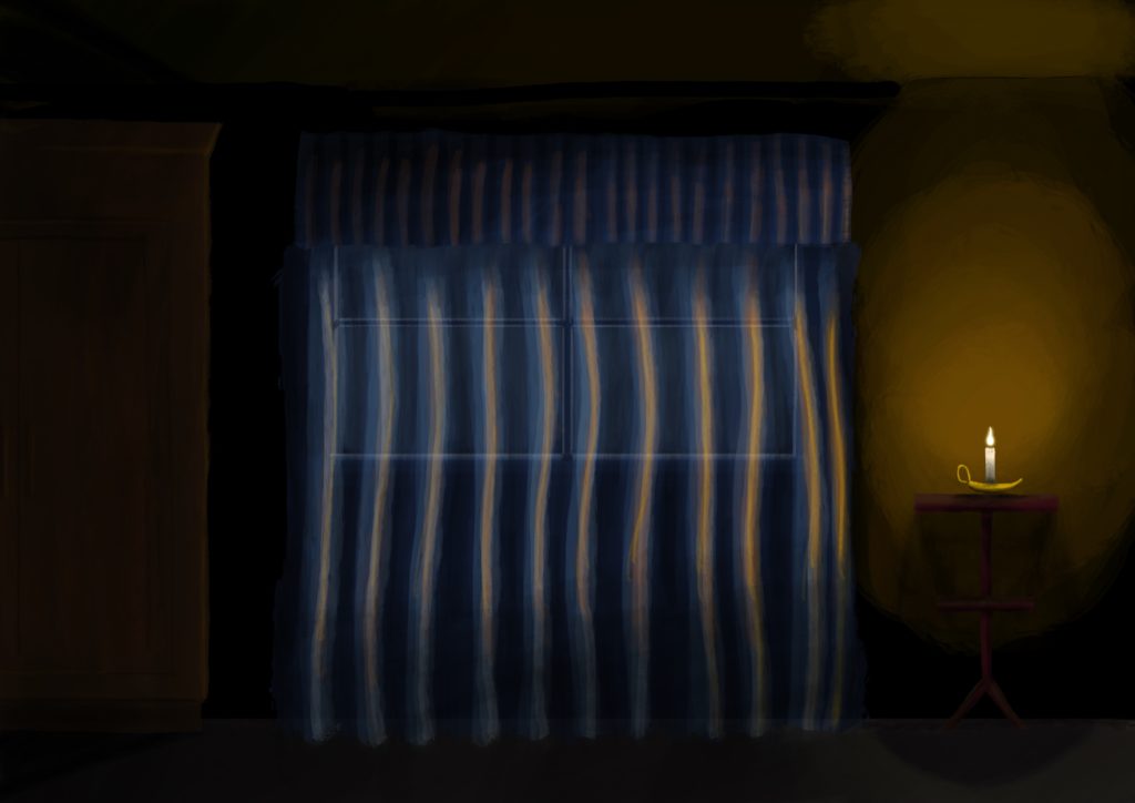
I’ve quite enjoy using Procreate’s Acrylic brush, you can get some really nice layer and lighting effects with it, and I used only that brush for this one:
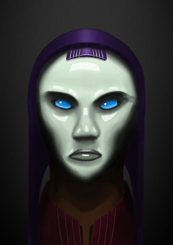
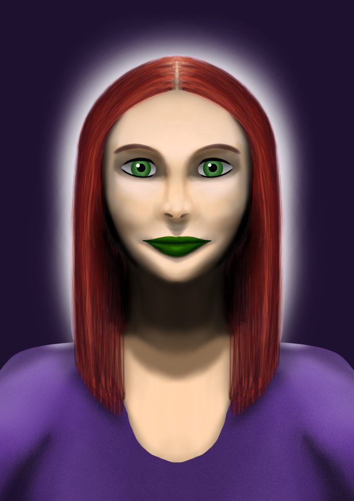
I don’t actually remember the brush I used for this next one, but I definitely took full advantage of Procreate’s symmetry guides so I could get it properly even:
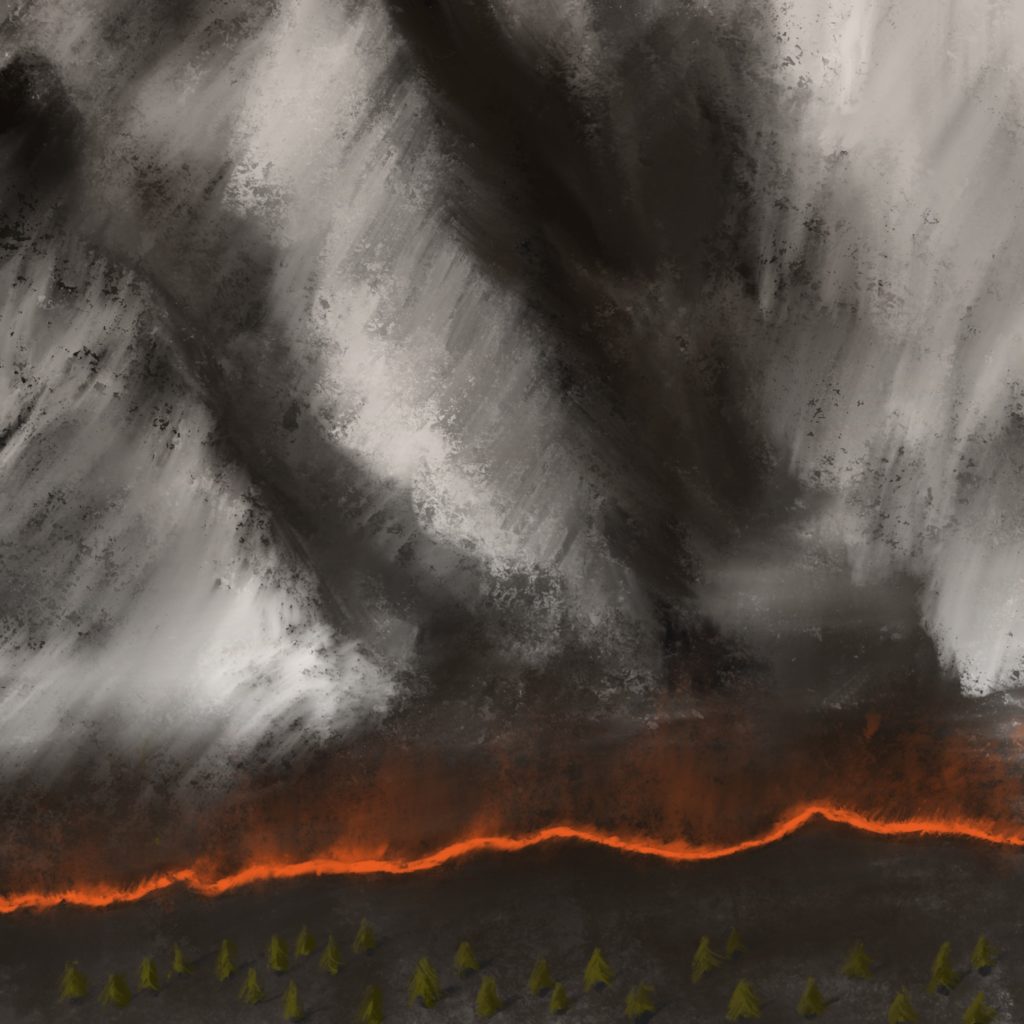
This next one is interesting, I was intending on the main structures that take up the top two-thirds of the image to look like a big craggy mountain range, but I showed it to Kristina and she can’t see it as anything but a tornado coming down!
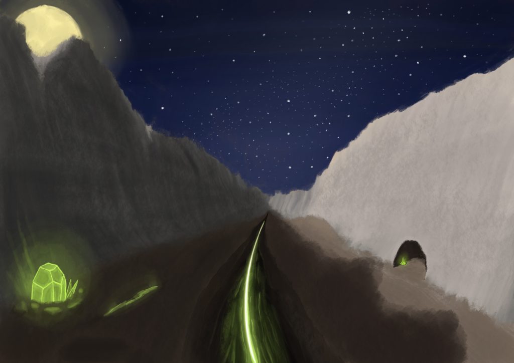
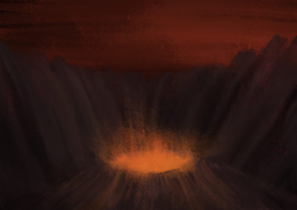
I quite enjoy doing epic-looking landscapes, and this one ended up starting out in a very different place than it finished. It was much more brown, the feature in the middle was a river, and the sky was a sunset which I didn’t manage to get looking how I wanted. In the end it became very much inspired by the aesthetic of the Hive from Destiny!
The paintings above were all done from about March to half-way through May, then there was a bit of a break until July.
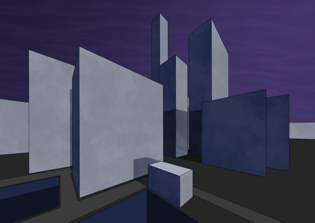
I decided to take advantage of Procreate’s drawing guide again, this time with the perspective guide. I was aiming for buildings in a futuristic city but the thing that I always struggle with is details and a sense of scale, so it didn’t turn out to be anything but big blocks. ? Still pleased with the shadows and sense of lighting though.
This next one I did as “speed-painting”, and did it in about 45 minutes! It was a combination of the acrylic brush and a palette knife brush from a big third-party brush pack I bought.
Then lastly, this one was done in August, again with Procreate’s symmetry guide on! I was going to give her a witch’s hat but couldn’t get it looking right.
I also had a burst of inspiration and got some more miniature painting done! I’m still working my way through the Dark Imperium box set I got nearly two years ago, but the main impetus here was Games Workshop releasing their “Contrast” line of paints. They’re essentially a base coat plus wash combined into one single coat, and they’re seriously incredible. Dark Imperium comes with twenty poxwalkers which I was dreading having to paint, but the Contrast paints made them far quicker to deal with! There’s twenty models (but only ten unique ones), and I’ve done half of them so far.
As part of doing this, I also discovered how much better the miniatures look when you apply a varnish to them! The Contrast paint specifically comes off a lot more easily than regular paint, so varnish is a necessity, but it also really makes the colours pop, they’re a lot more vibrant than without it.

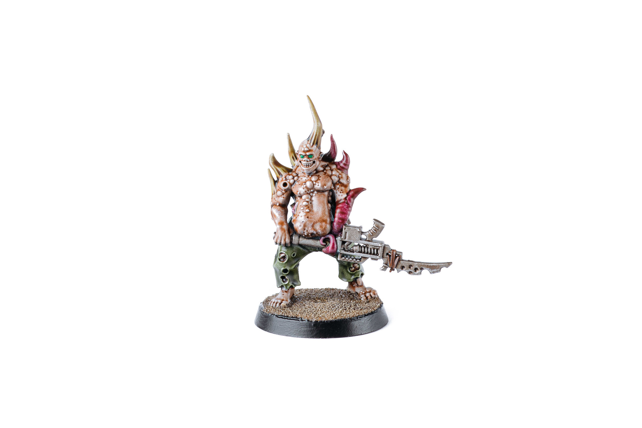

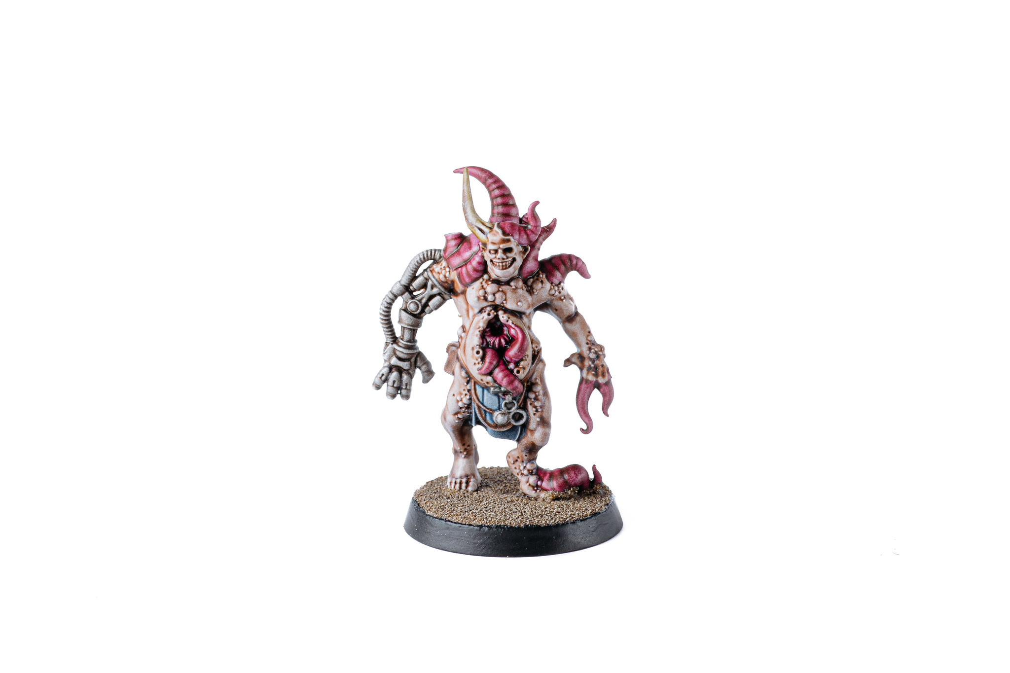
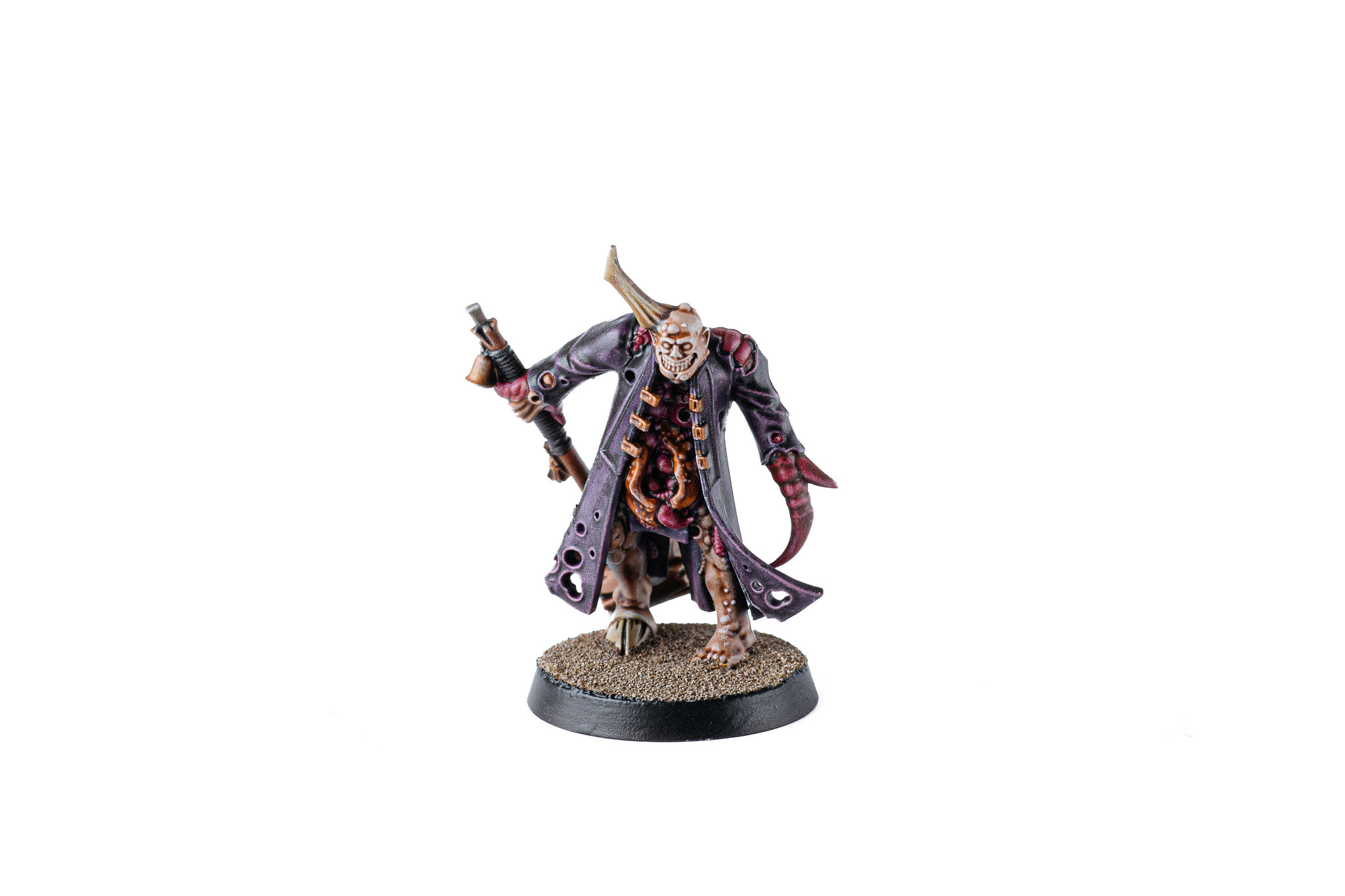
I also finally finished off the Plague Marine champion that’d been sitting there mostly-finished for months, and I’m really happy with the base I did. I had a bunch of really old Space Marines from a starter painting box that a friend had given me, so I sacrificed one of them and cut him up to adorn the base, and it looks absolutely fantastic.
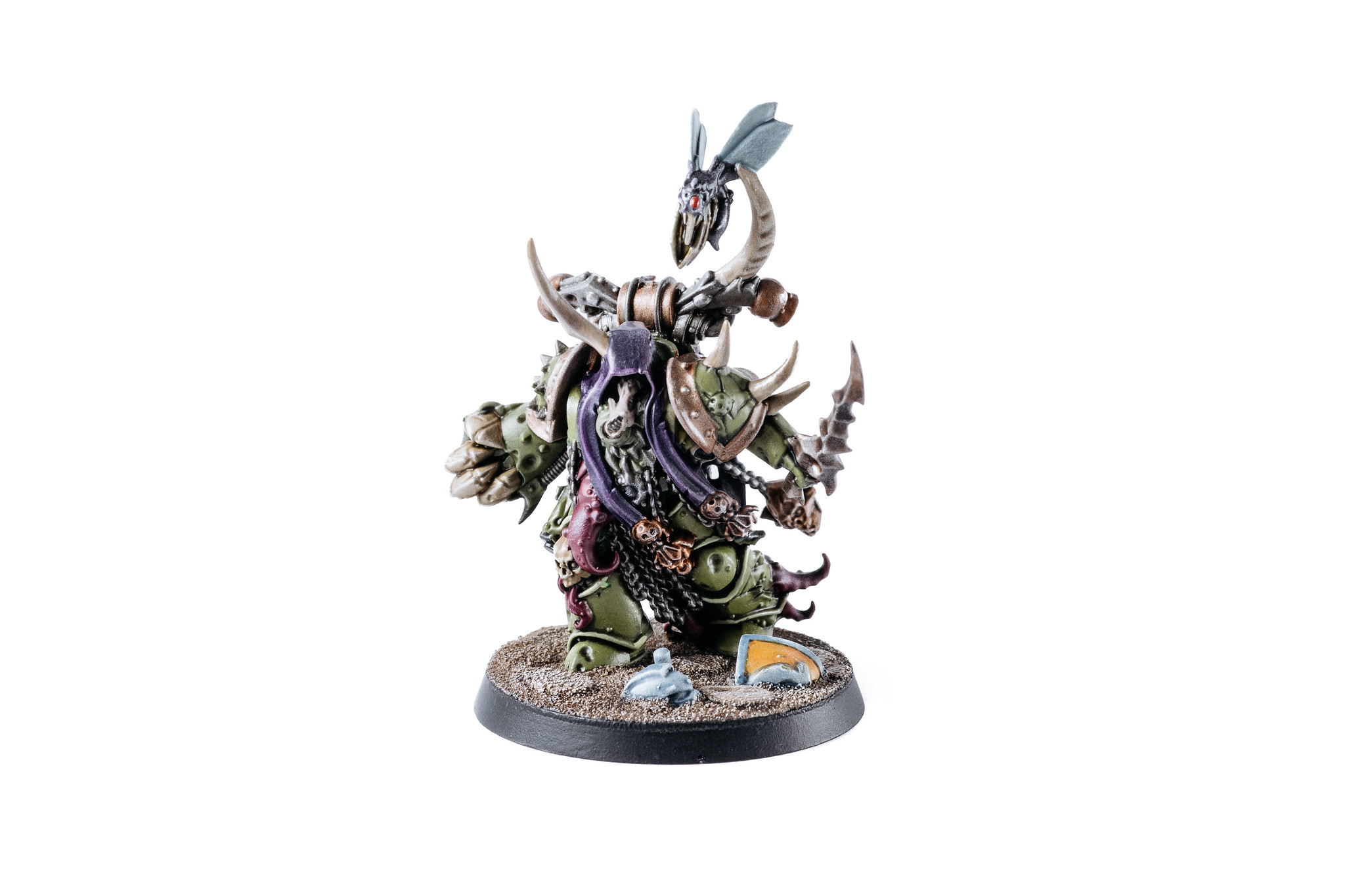
It’s fascinating seeing the evolution of Games Workshop’s plastic miniatures, back when I started (*cough*24 years ago*cough*) plastic was the cheap and crappy option, and the pewter (or lead as they were back then!) miniatures were much more detailed. Nowadays it’s very much the reverse, the plastic is INSANELY detailed — have a look at the full-size poxwalkers on Flickr and zoom all the way in — and the pewter ones are a bit shit by comparison.
There’s also a small-scale Warhammer 40,000 game called Kill Team that I’ve started playing at work with some people, and have bought the new box set that was released in September. It’s similar to Shadespire in that your squads only have a small number of miniatures so it’s much more feasible to get them painted, but it comes with a bunch of absolutely amazing-looking terrain. I put it together and took a couple of photos prior to it being painted, just to get a sense of the scale and what the terrain looks like.
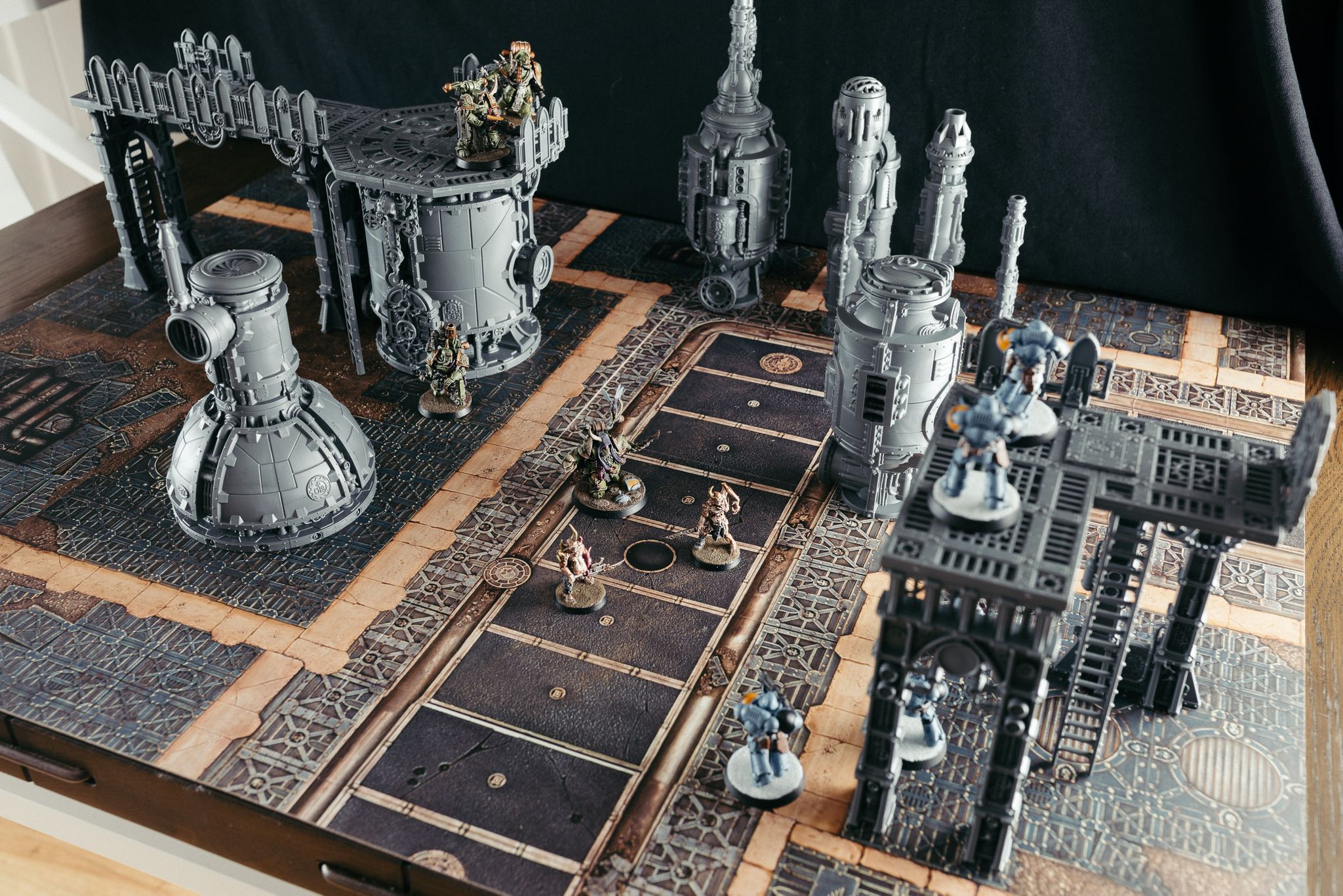
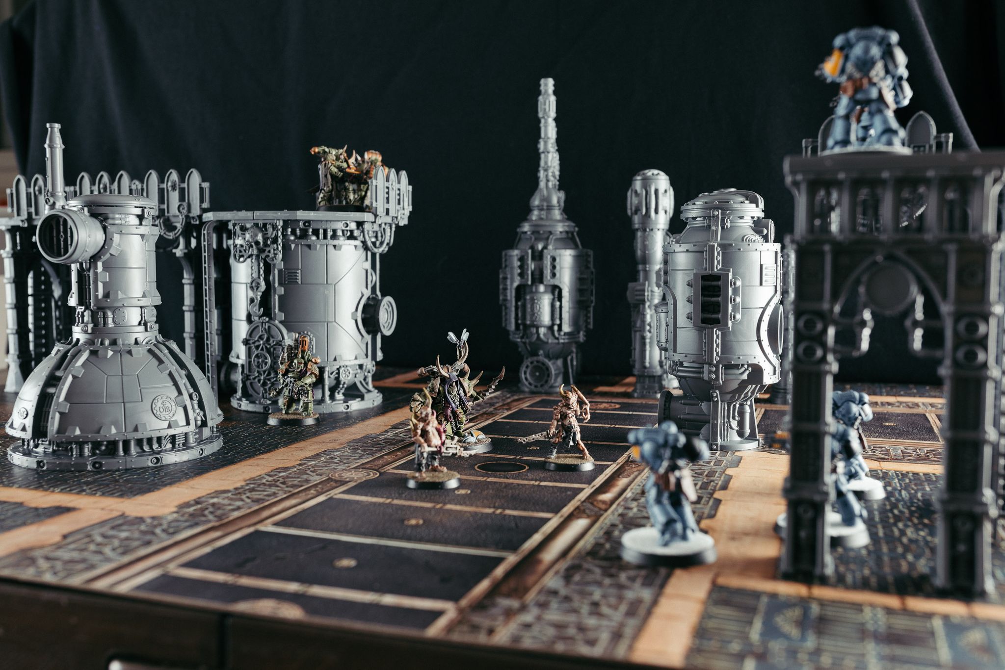
I’ve finished painting a couple of pieces of it, but it’s so big that I don’t have a large enough white backdrop that’ll fit the whole terrain piece! Photos will definitely be forthcoming once I do get said backdrop though. ?
