An artistic update

An artistic update

I posted back in February about some of the stuff I’d been doing in Procreate on my iPad, and I’m overdue for another post! I haven’t been doing as much in the intervening months, as there’s been lots of other things taking up my time and I haven’t felt as inspired but I still managed to do a few.

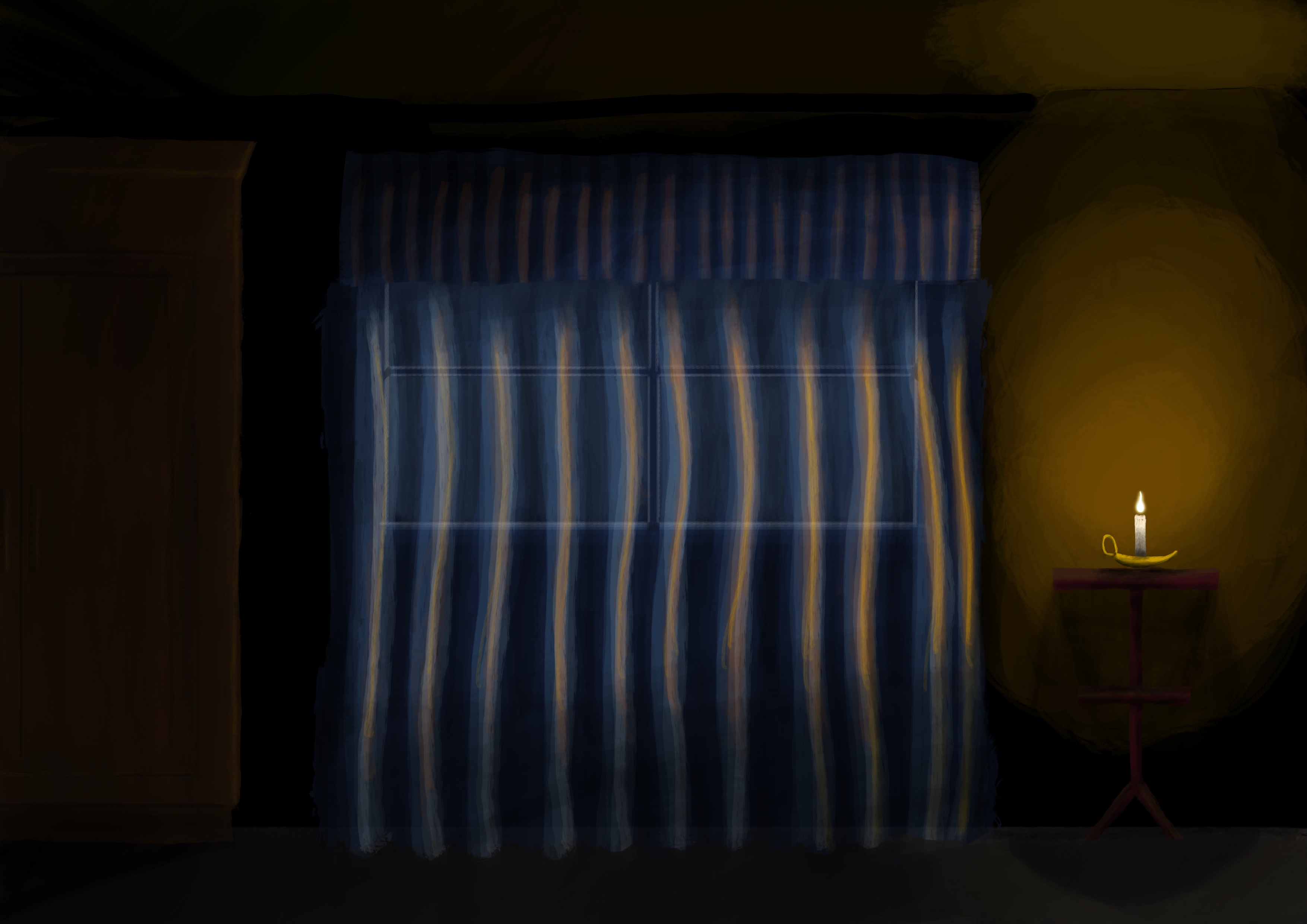
I’ve quite enjoy using Procreate’s Acrylic brush, you can get some really nice layer and lighting effects with it, and I used only that brush for this one:

A painting of a window at night, from inside a room. There's sheer curtains over the window, a candle is on a small table at the right casting light, and there's a tall cupboard at the left in the shadows.
The Window

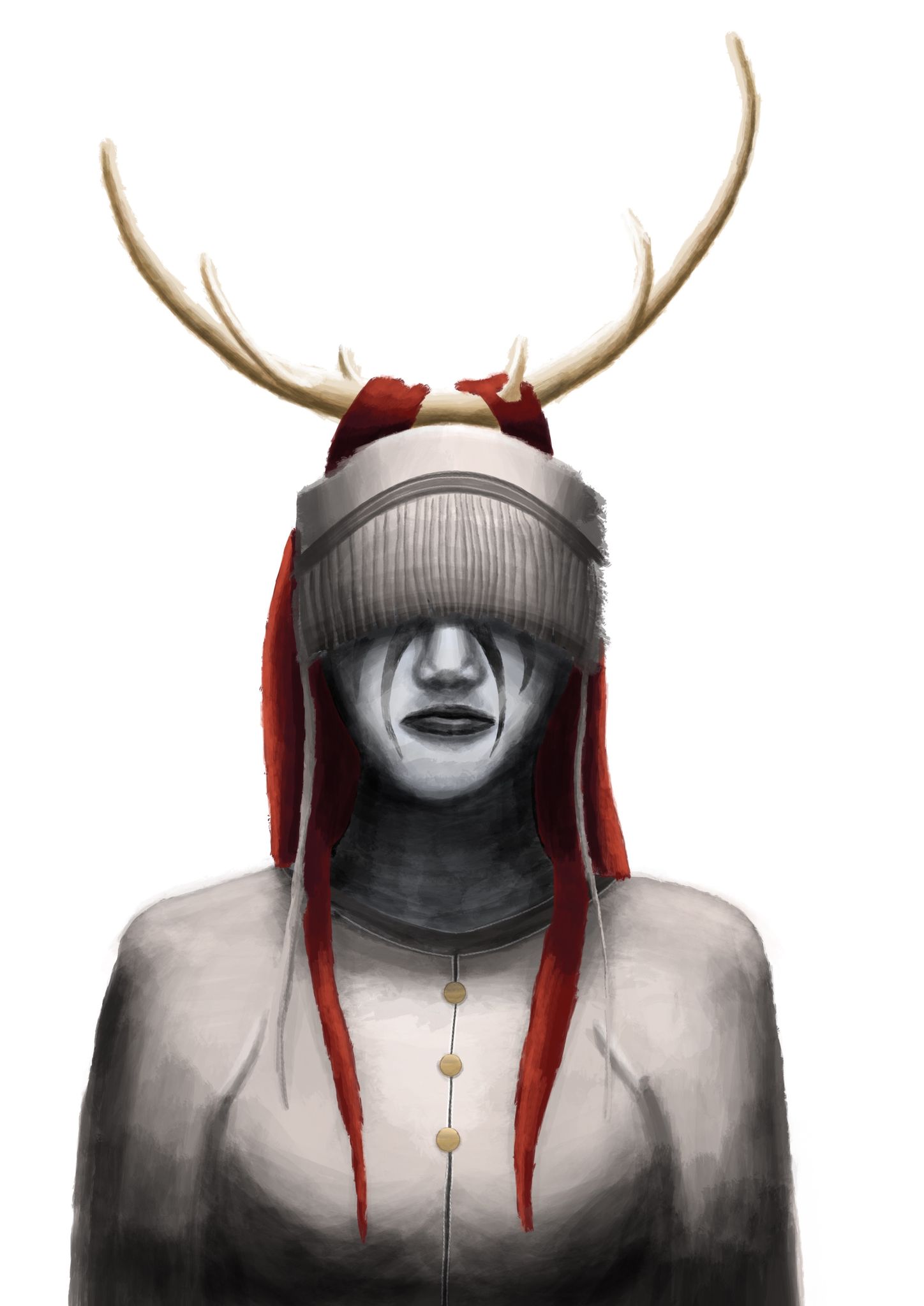
I don’t actually remember the brush I used for this next one, but I definitely took full advantage of Procreate’s symmetry guides so I could get it properly even:

A painting of a cybernetic woman, her eyes look like blue glass and she has green and very shiny "skin". She has a purple hood over the back of her head.
Cybernetic Woman

This next one is interesting, I was intending on the main structures that take up the top two-thirds of the image to look like a big craggy mountain range, but I showed it to Kristina and she can’t see it as anything but a tornado coming down!

A painting of a craggy grey mountain range in the top two-thirds of the image, with a river of fire making its way the whole way across the image, and a bunch of conifers at the bottom.
The River

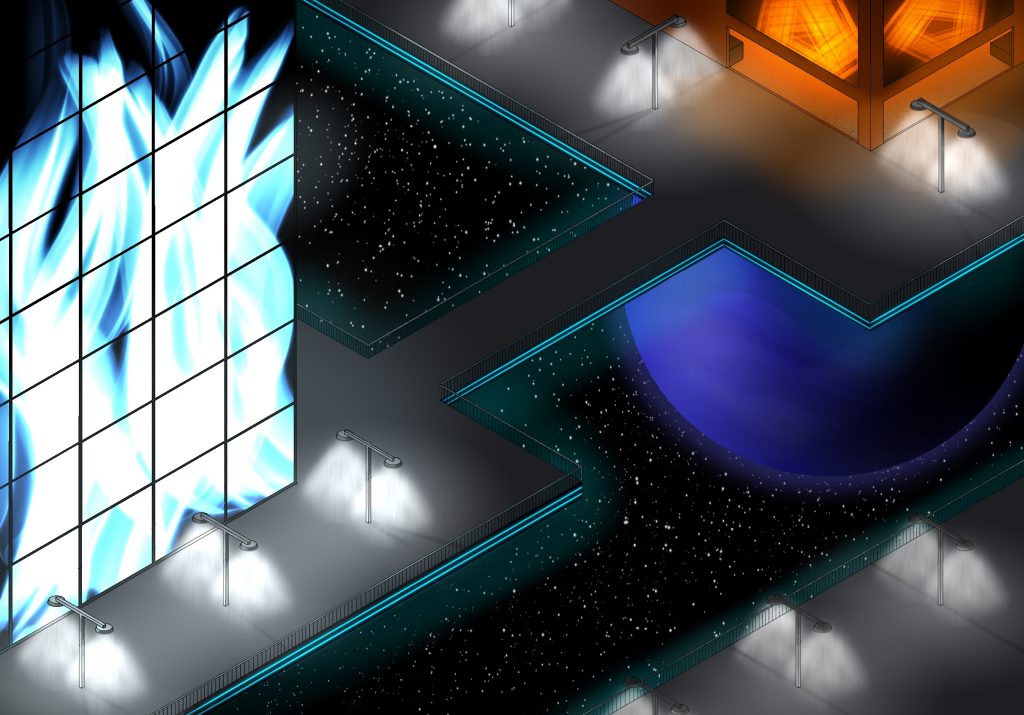
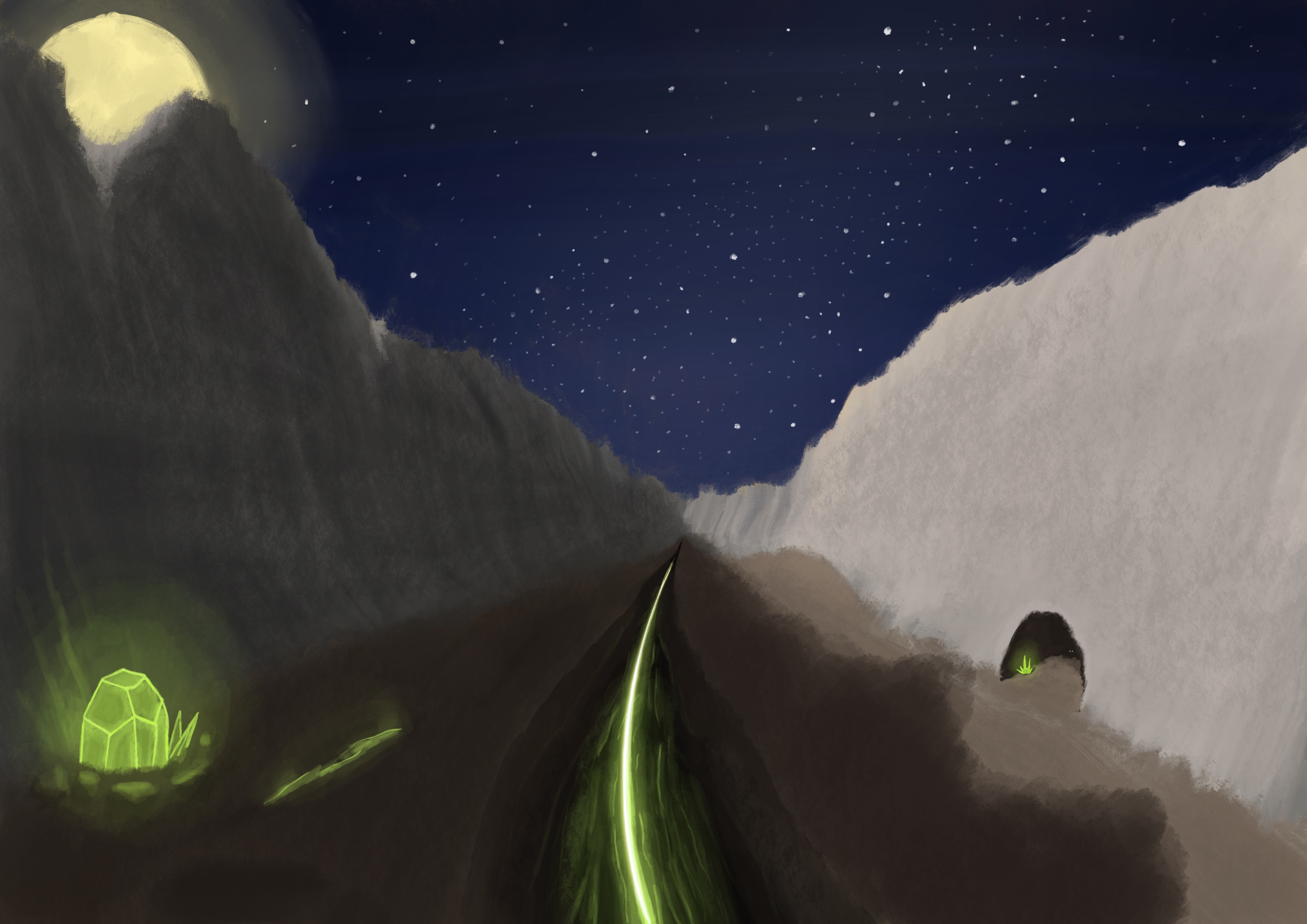
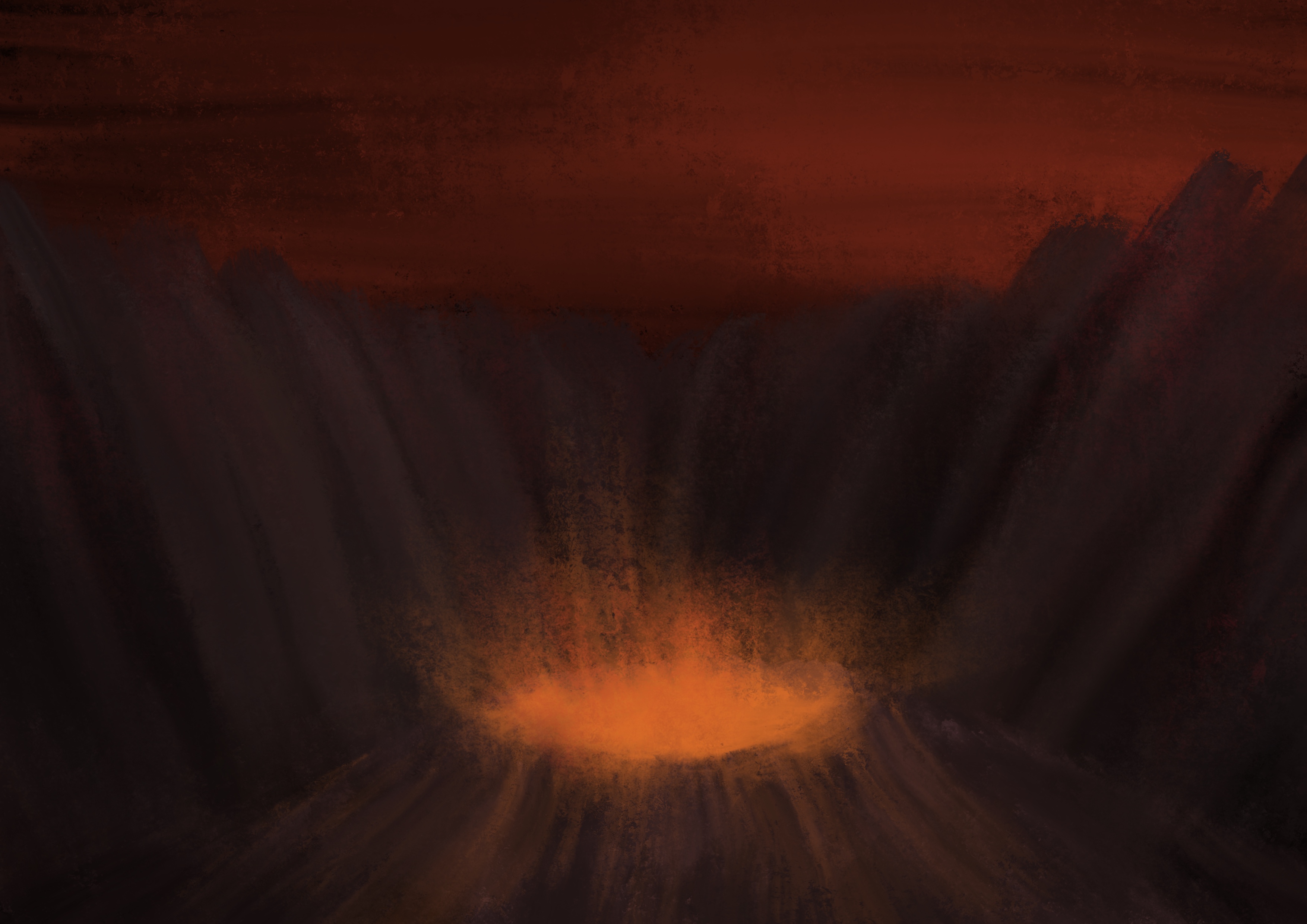
I quite enjoy doing epic-looking landscapes, and this one ended up starting out in a very different place than it finished. It was much more brown, the feature in the middle was a river, and the sky was a sunset which I didn’t manage to get looking how I wanted. In the end it became very much inspired by the aesthetic of the Hive from Destiny!

A painting looking down a desolate grey rocky valley. A deep black rift runs down the middle with a sickly green glow at the bottom, at the left is a crystal embedded in the ground with the same green glow coming from it. At the right is a cave entrance in the valley wall with another glowing crystal. The sky is awash with stars, and the moon peeks from behind the valley peak at the far left.
The Emergence

The paintings above were all done from about March to half-way through May, then there was a bit of a break until July.

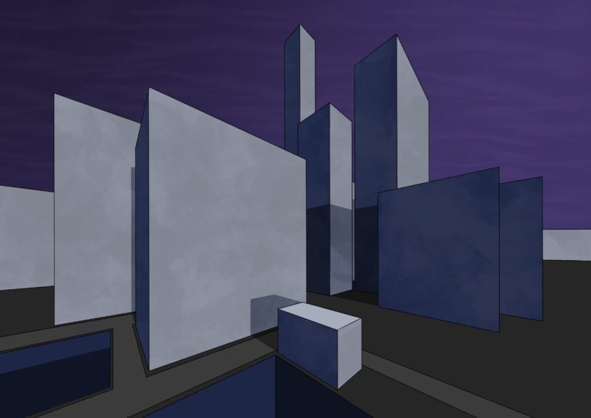
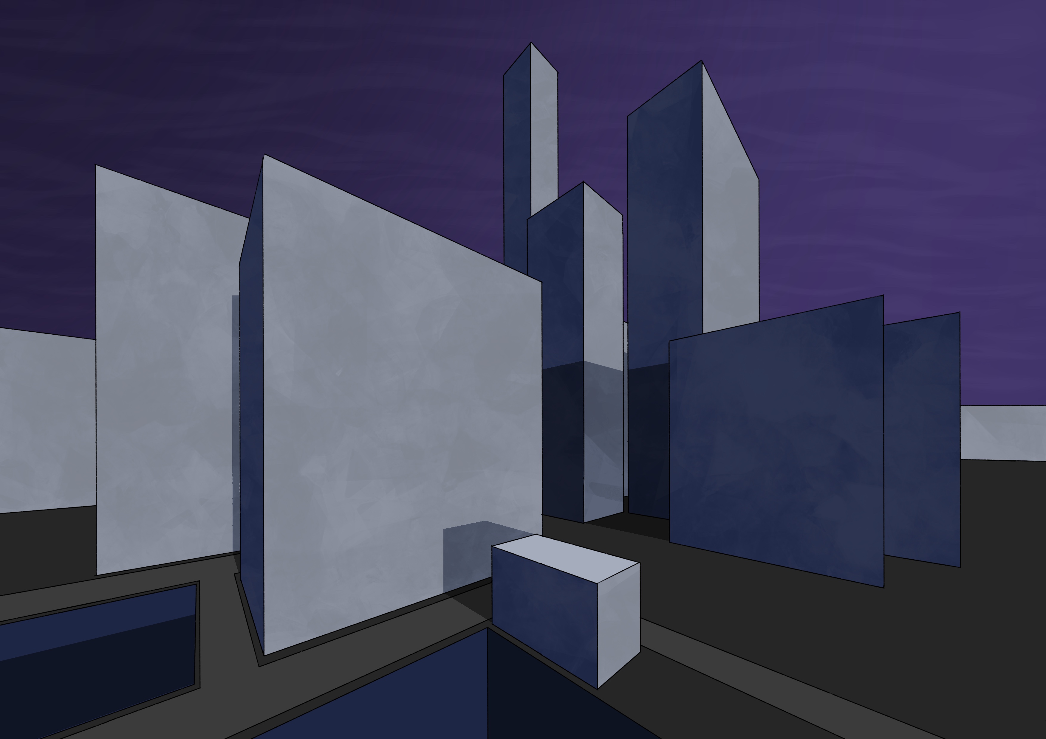
I decided to take advantage of Procreate’s drawing guide again, this time with the perspective guide. I was aiming for buildings in a futuristic city but the thing that I always struggle with is details and a sense of scale, so it didn’t turn out to be anything but big blocks. ? Still pleased with the shadows and sense of lighting though.

A very clean geometric painting of grey and blue city buildings. The sky is purple and the light is coming from the very right, the buildings casting shadows to the left.
City Buildings

This next one I did as “speed-painting”, and did it in about 45 minutes! It was a combination of the acrylic brush and a palette knife brush from a big third-party brush pack I bought.

A painting of a volcano erupting atop a hill, the hill is surrounded by taller mountains all around, and the sky above is filled with striated dark orange clouds.
Volcano

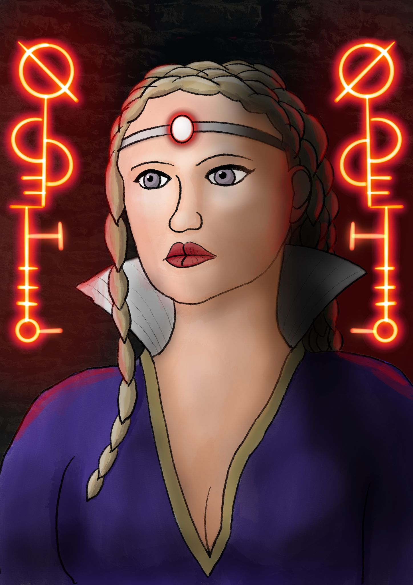
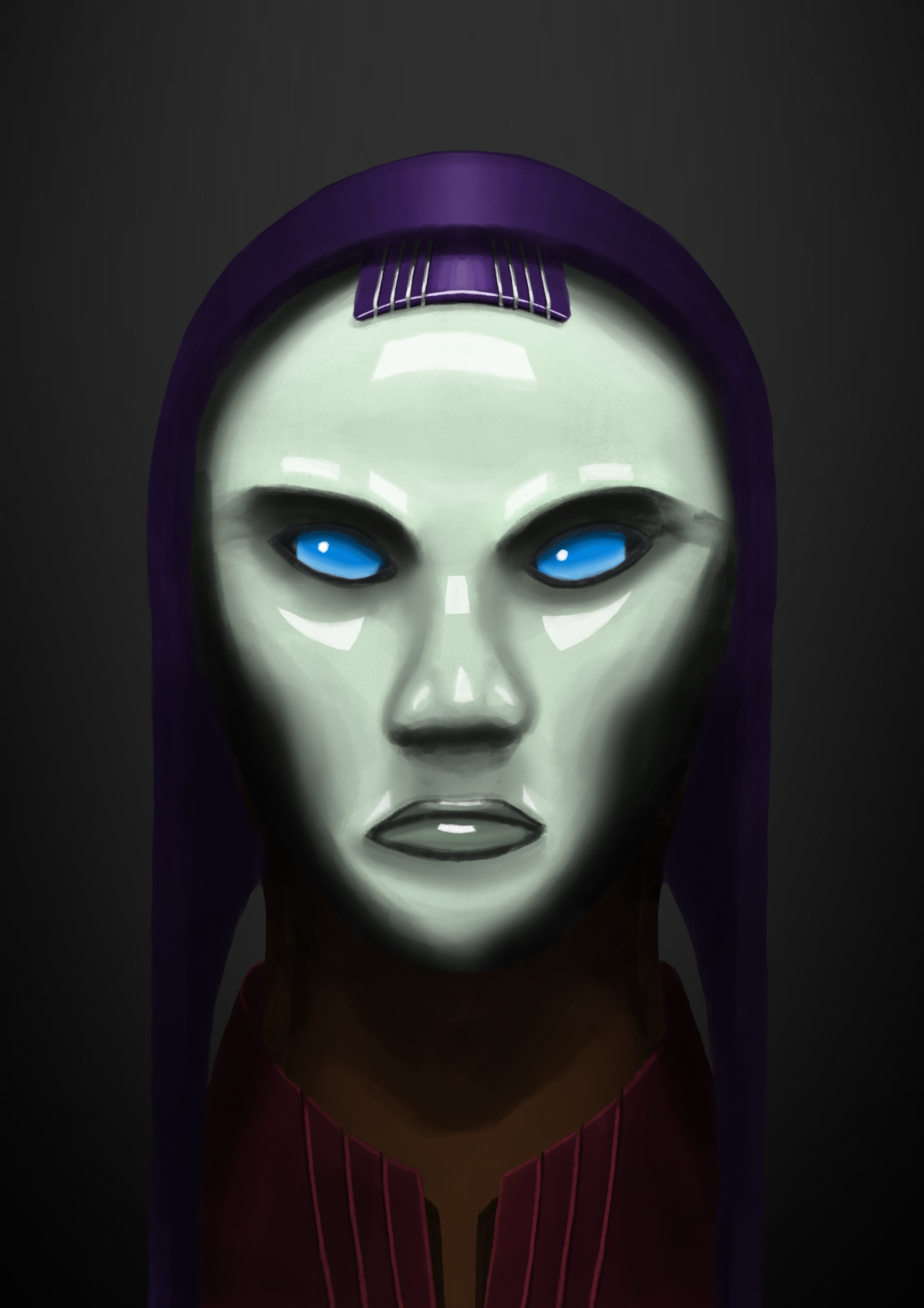
Then lastly, this one was done in August, again with Procreate’s symmetry guide on! I was going to give her a witch’s hat but couldn’t get it looking right.

A head and shoulders portrait painting of a white woman with piercing green eyes, long red hair, and dark green lipstick. She’s wearing a dark purple top, and there’s a bright light shining behind her that’s lighting up her shoulders and the very edges of her hair.
The Witch

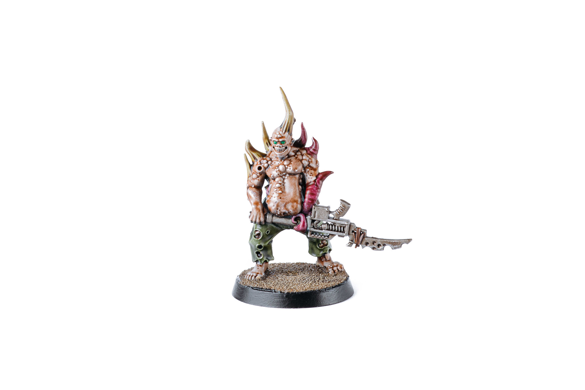
I also had a burst of inspiration and got some more miniature painting done! I’m still working my way through the Dark Imperium box set I got nearly two years ago, but the main impetus here was Games Workshop releasing their “Contrast” line of paints. They’re essentially a base coat plus wash combined into one single coat, and they’re seriously incredible. Dark Imperium comes with twenty poxwalkers which I was dreading having to paint, but the Contrast paints made them far quicker to deal with! There’s twenty models (but only ten unique ones), and I’ve done half of them so far.

As part of doing this, I also discovered how much better the miniatures look when you apply a varnish to them! The Contrast paint specifically comes off a lot more easily than regular paint, so varnish is a necessity, but it also really makes the colours pop, they’re a lot more vibrant than without it.

Poxwalker 1
Poxwalker 2
Poxwalker 3
Poxwalker 4
Poxwalker 5

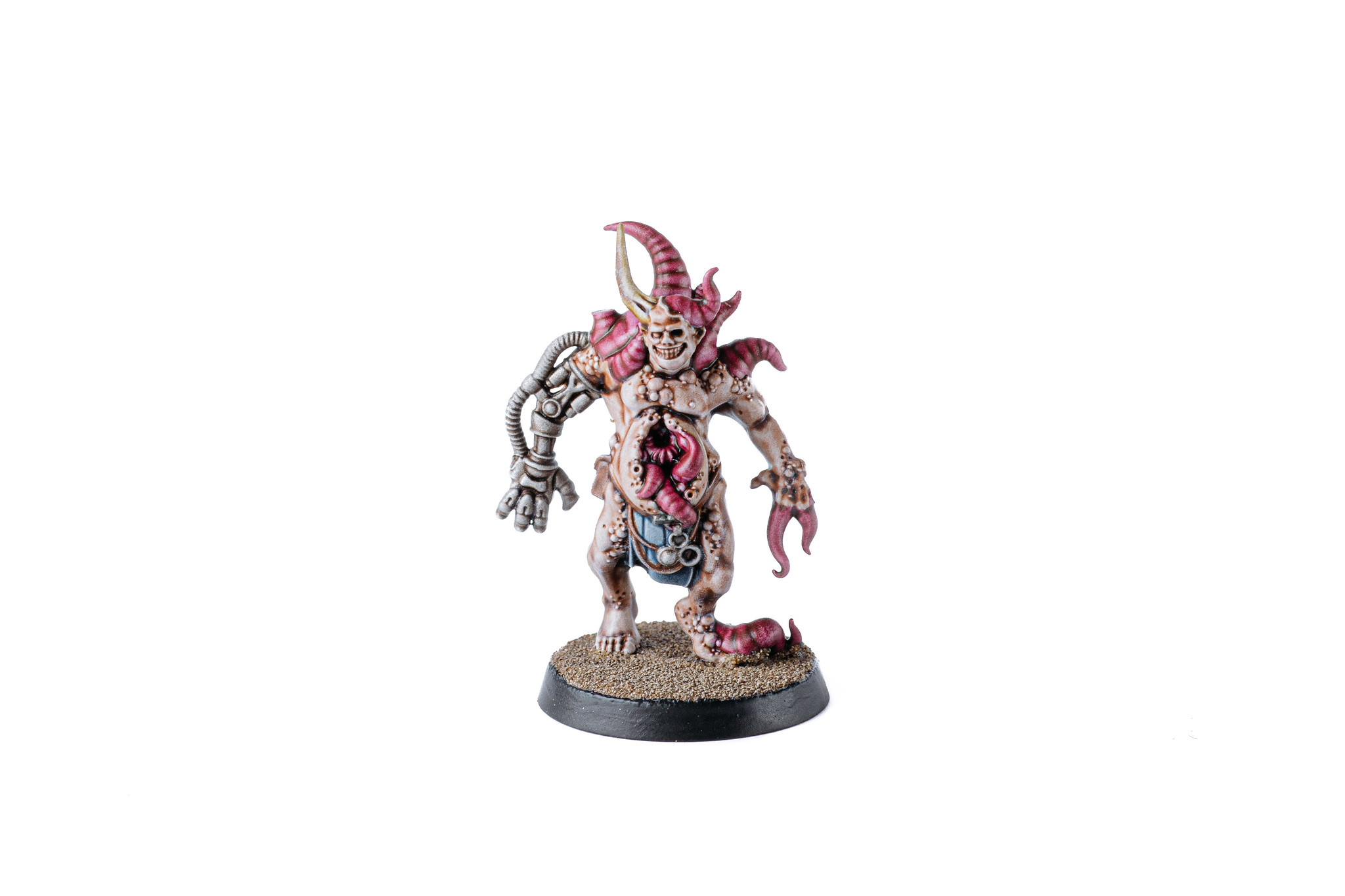
I also finally finished off the Plague Marine champion that’d been sitting there mostly-finished for months, and I’m really happy with the base I did. I had a bunch of really old Space Marines from a starter painting box that a friend had given me, so I sacrificed one of them and cut him up to adorn the base, and it looks absolutely fantastic.

Plague Marine Champion

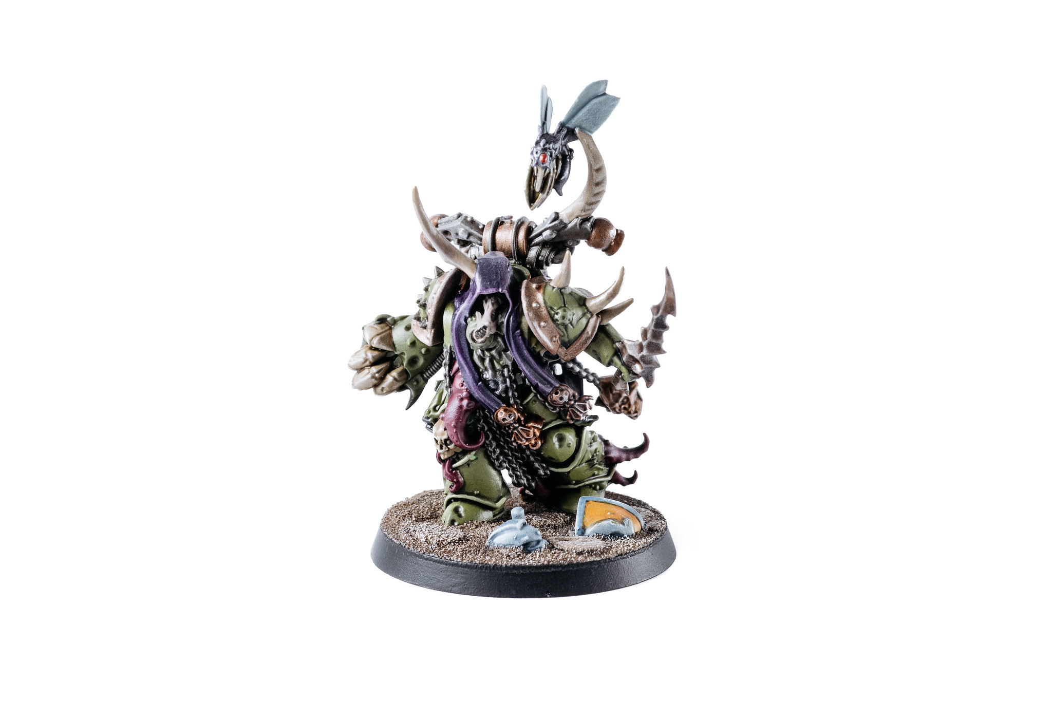
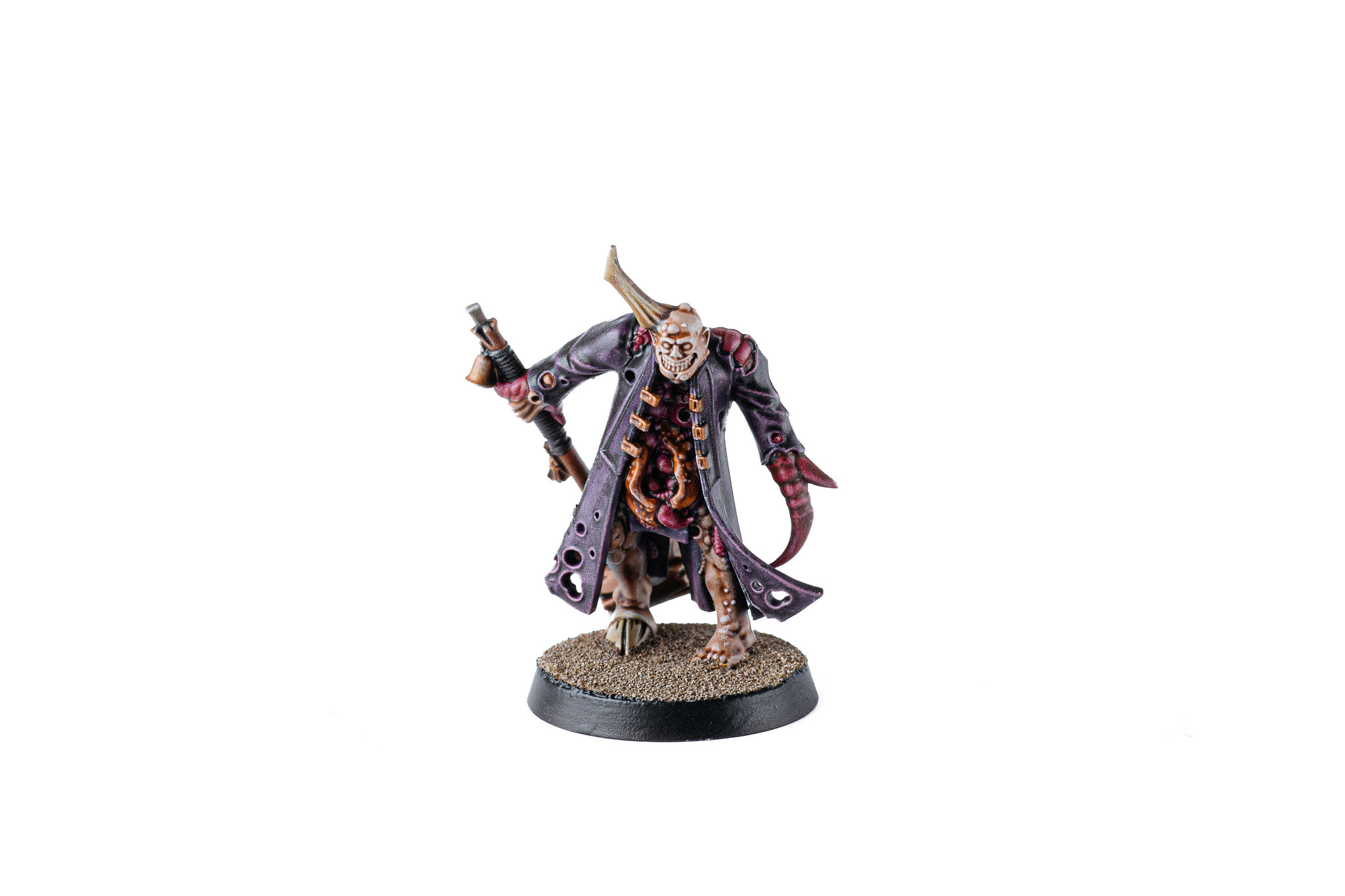
It’s fascinating seeing the evolution of Games Workshop’s plastic miniatures, back when I started (*cough*24 years ago*cough*) plastic was the cheap and crappy option, and the pewter (or lead as they were back then!) miniatures were much more detailed. Nowadays it’s very much the reverse, the plastic is INSANELY detailed — have a look at the full-size poxwalkers on Flickr and zoom all the way in — and the pewter ones are a bit shit by comparison.

There’s also a small-scale Warhammer 40,000 game called Kill Team that I’ve started playing at work with some people, and have bought the new box set that was released in September. It’s similar to Shadespire in that your squads only have a small number of miniatures so it’s much more feasible to get them painted, but it comes with a bunch of absolutely amazing-looking terrain. I put it together and took a couple of photos prior to it being painted, just to get a sense of the scale and what the terrain looks like.

A photo of some Death Guard and Space Wolves miniatures on the new Kill Team starter box terrain. The terrain itself is unpainted grey plastic but is towering over the miniatures and has a very steampunk aesthetic to it.

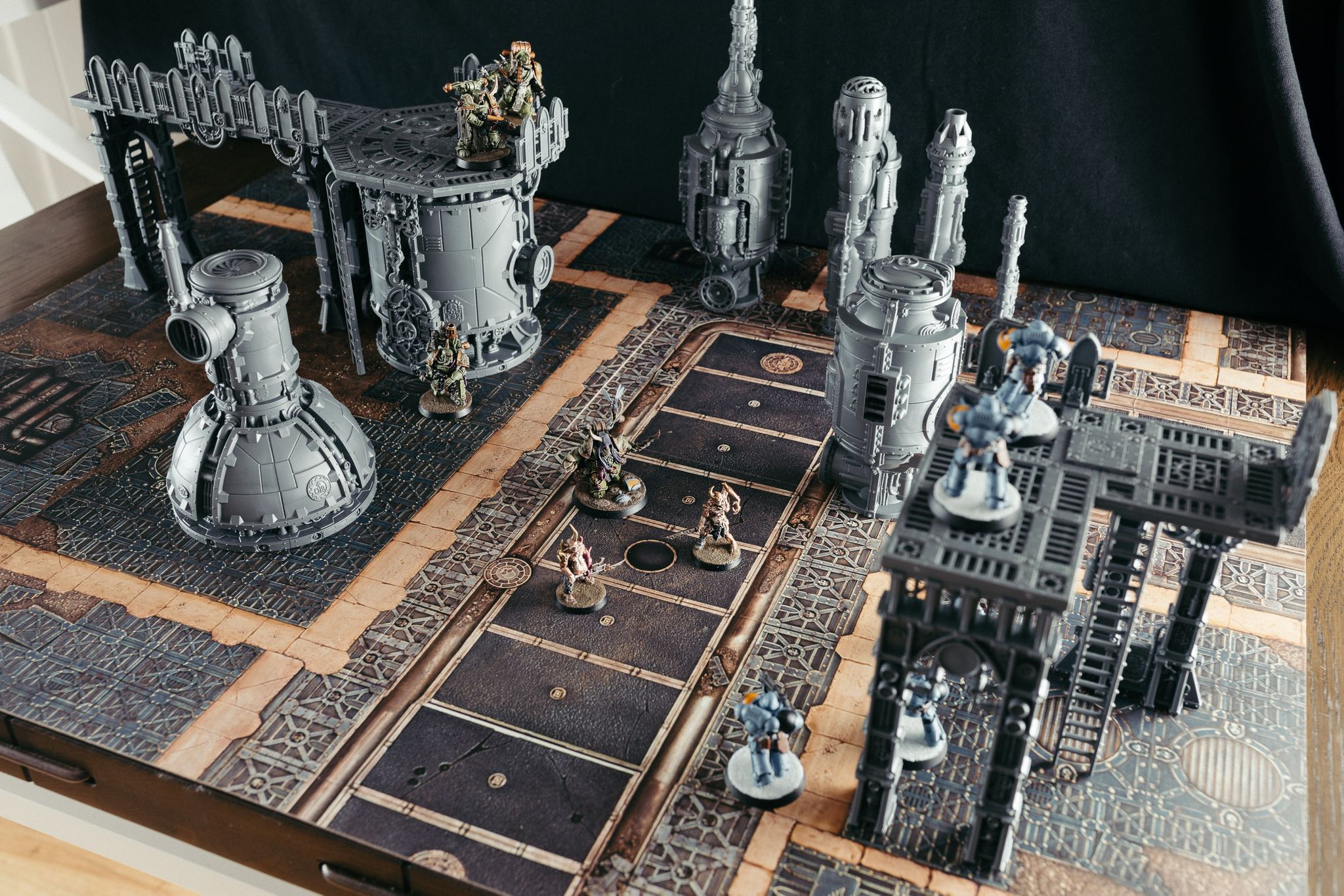
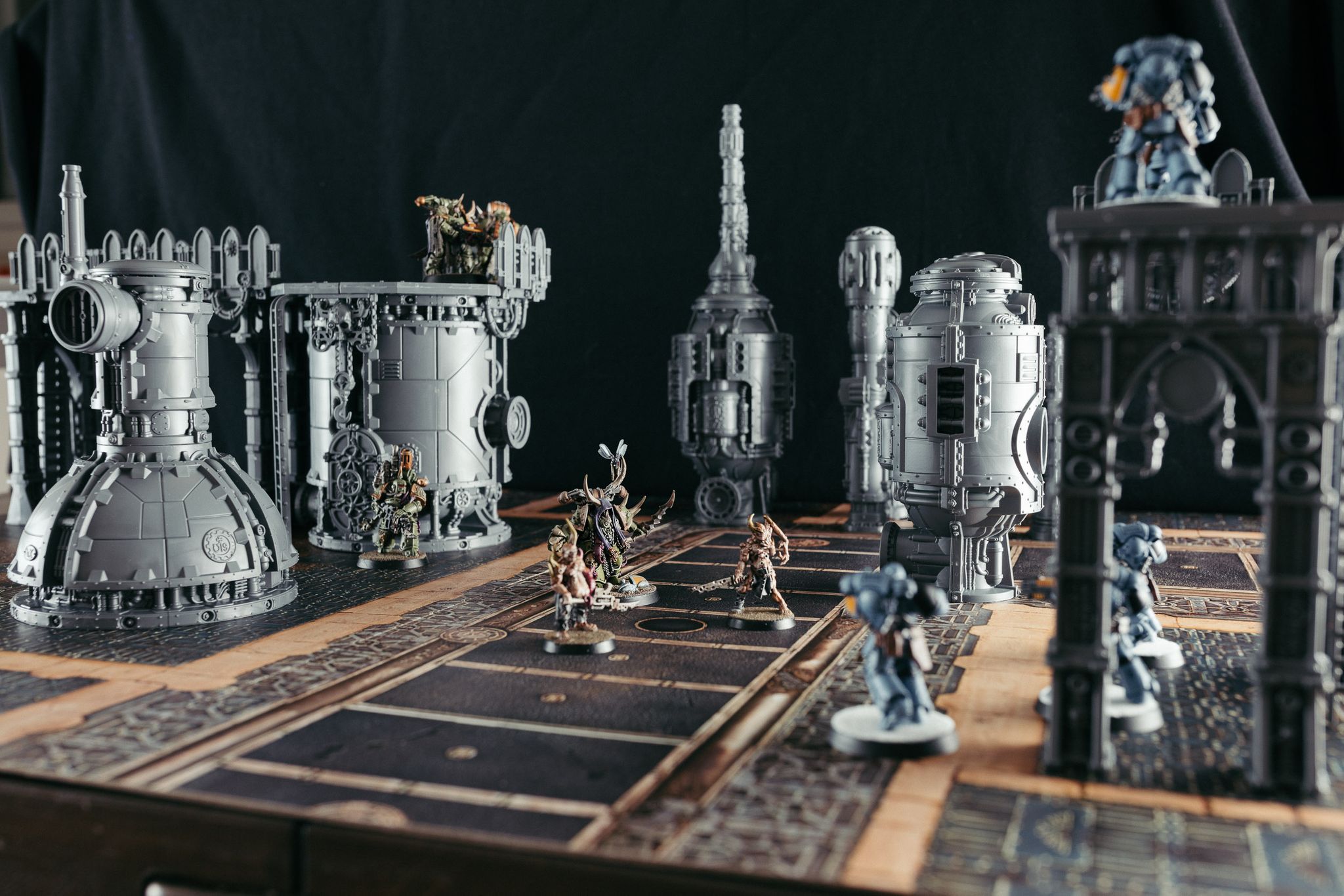
I’ve finished painting a couple of pieces of it, but it’s so big that I don’t have a large enough white backdrop that’ll fit the whole terrain piece! Photos will definitely be forthcoming once I do get said backdrop though. ?

Art update, February 2019

Art update, February 2019

As previously mentioned, I’ve been enjoying the hell out of my iPad Pro and Apple Pencil, and have been doing a whole lot more drawing/sketching/painting since then. I moved my Mastodon account over to a much smaller instance, mastodon.art, which as you’d expect is very focused on art and has a lot of extremely creative people on it, and I’ve been getting a daily dose of inspiration. (As a side-note, I can’t recommend enough moving to a smaller Mastodon instance as opposed to one of the huge ones like mastodon.social… it really does feel much more like a community, and the local timeline is something you actually can keep up with and interact with).

I found a really good series of tutorials on drawing people and facial expressions, and drew this!

Four cartoon-style heads: a white girl with long blonde hair looking unimpressed, a bald Asian man looking shocked, a black man with big hair and a goatee looking sleepy, and an Indian man smirking with one eyebrow raised.

After that were a bunch more extremely munted-looking people which I’m not going to post, but then I eventually got my proportions better.

A portrait sketch of a pale red-haired woman with green eyes, smirking and raising one eyebrow.

One of the artist-types I follow on Mastodon is Noah Bradley, he’s done paintings for all sorts of places including for Magic: The Gathering! He said he biggest piece of advice was “Use more reference!”, i.e. have an actual picture/photo/whatever next to the thing you’re drawing so you can get the proportions and such correct. I took that advice to heart, and painted this picture of what ended up as a queen!

A painting of a white woman from the chest up, lit from the left side while her right side is heavily shadowed. She has long braided blonde hair and is wearing a purple high-collared dress. Behind her and to her left and right are glowing red eldritch runes, giving a faint red tinge to her outline.

She looks nothing like the original photo, of course, but it really helped to get the angles of everything correct. I also really started getting the hang of lighting, I’m so pleased with the light from the runes that’s reflecting off her hair, especially on the right.

Lily’s Christmas present was the first-gen Apple Pencil for her own iPad and she’s been absolutely drawing her heart out as well. One of the things she likes drawing are My Little Pony characters… she’s never watched the show but enjoys making up her own characters. She set me a challenge of making a character myself, with the theme of “neon”, and I took that opportunity to do some more practice with lighting (see the linked image for the full effect). I found an outline online and traced over that for the shape, but the colour is all me!

A side-on painting of a My Little Pony character on a black background, coloured in dark blue with neon blue lightning at the top of her hooves and a dark purple tail with a purple neon light running down it.

We also took my old teddy bear Neddy out, who I’ve had since I was a year old, and used him for some lighting practice.

A three-quarter profile of a brown teddy bear on a black background, the edges of the left side of him are lit from a bright white light source to the left of the painting.

Then my latest work was Maria Franz from the band Heilung! They do epic pagan/folk music and it’s absolutely fantastic (see the video of their live show). I introduced Lily to them and she’s now completely obsessed. She sent me a picture of Maria Franz that she’d traced over and coloured in, and I realised that’d be a perfect bit of subject matter.

A painting of a woman from the chest up, she has antlers on her head and long red hair, and has headgear that goes over her forehead, with tassles obscuring her eyes.

I had a picture of her open in Safari in split-screen view so I could get the outline and proportions right, and Procreate tells me this was nearly 10 hours all up! I’m absolutely stoked with how it ended up, and just seeing the difference between my earliest stuff and now is great, even though it’s only been two months. The “Use reference” mantra is one that I’m definitely taking to heart.

New shiny: 11″ iPad Pro and Apple Pencil 2

I bought an iPad mini 2 back in April of 2014, which was the first mini with a retina display. It got fairly slow with the upgrade to iOS 11, and even though iOS 12 gave it a bit of a shot in the arm, it still ultimately struggled to do much beyond very basic web browsing and social media things — not entirely surprising given it’s five years old at this point. Apple announced the latest version of the iPad Pro at the end of October last year, along with an updated Apple Pencil, and all the reviews said the iPad was absolutely gobsmackingly fast (to the point where it beats all but the highest-end Core i9 15″ MacBook Pro in a number of CPU benchmarks), so I decided to finally retire the iPad mini and upgrade.

Holy. Crap.

It’s honestly one of the most impressive pieces of technology I’ve used in recent years; almost the entire thing is screen, there’s only enough bezel to comfortably hold the edges and no more, and it’s about as thin as I recall the iPhone 4/4S being, with the same industrial design. I’m still on the iPhone 7 so haven’t used Face ID before, and it works like magic. The screen has a 120Hz refresh rate as opposed to the standard 60Hz of most displays, and it means that everything feels just subtly more fluid and responsive. Everything I do on it is just totally effortless, it responds immediately without any hint of lag or hesitation.

However, I think my favourite part so far is the Apple Pencil. It’s much the same as the original in terms of usage, but magnetically pairs and charges on the right side of the iPad, and has an option to double-tap the Pencil itself to switch between your current drawing tool and the eraser tool. It has pressure and angle sensitivity, so can behave exactly like an actual pencil. Turn it sideways and use the edge and you can do subtle shading, and the harder you press the darker the shade.

The built-in Notes app has basic Pencil support, but I’ve been using Procreate — which I actually originally bought on my iPad mini but didn’t use very much due to it being a pain trying to do any sort of detail with a finger — and it’s so awesome. It’s absolutely not going to win any sort of awards, but I’ve done two things so far and am really happy with both of them.

The first was done with the drawing assist turned on and an isometric grid, followed by a whole bunch of layers to get the lighting looking right.

And the second is just a pencil sketch. Like I said, objectively it’s not very good, but not having done anything like this before, I’m still very pleased.

I had a photo open in Safari in split-screen view beside Procreate, the woman in my sketch looks absolutely nothing like the photo but it was more just generally to get the angles right. 😛 My having done photography definitely helped with the shading because I could easily visualise in my head how the shadows would fall.

I need to make sure I keep up the practise so I can improve!


I also remembered that GarageBand on iOS is a thing, and goddamn, it’s also impressive. It’s the same idea as in GarageBand on the Mac with adding preset loops of instruments and combining them together — or recording your own — but they’ve done an amazing job of translating that to something that’s usable with a touch interface. I’d made a couple of songs in GarageBand for Mac previously (nearly twelve years ago now, jesus), but not really anything since.

I bought a USB-C to 3.5mm headphone adapter for the iPad so I could use my big Audio Technica headphones — doing audio work requires very low latency, and Bluetooth has way too much latency, to the point where if you try to use Bluetooth headphones with GarageBand on iOS it’ll give you a big warning to that effect — and did a bunch of dabbling the other day, and made another new song!


I’m very interested to see what Apple does with iOS 13 this year, because the iPad Pro’s hardware is astonishingly capable, but it feels like the software could be doing more. I’ve hooked up our spare Bluetooth keyboard and dabbled around in that and it’s neat, but there’s not enough support for keyboard shortcuts even in Apple’s own applications . In Messages, for instance, you can use Cmd-↑ and Cmd-↓ to switch between conversations, but there’s no way to get the focus back to the input field once you’ve done so… you have to reach for the screen. There’s an official Apple keyboard cover that turns your iPad into something resembling a laptop, but I don’t know how well it would work remaining steady on a lap on a train.

All that said, I’m absolutely stoked with the new iPad, and am seriously keen to see the software catch up to the capabilities of the hardware!